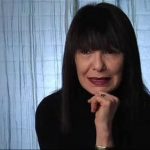
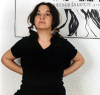
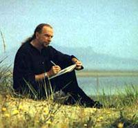
The Business of Art: A Conversation with Aleksandra Mir
NYFA Current asked artist Aleksandra Mir to contribute an article based on her project for the upcoming group show Communism at Project Arts Centre in Dublin. For the exhibition, curator Grant Watson asked a group of artists to respond to this term and consider its contemporary relevance.
What follows is an excerpted transcript of a phone conversation Mir had with Jim Fitzpatrick, the creator of the original—and now iconic—Che Guevara poster image. She spoke from New York over the phone to the Dublin-based Fitzpatrick on January 3 about his iconic image and how such images are constantly in a state of flux. A transcript of the entire conversation can be accessed on Mir’s website, www.aleksandramir.info
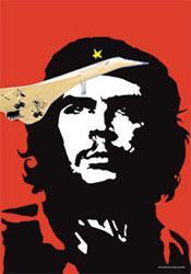
Aleksandra Mir: A couple of communist neighbors in the Swedish neighborhood where I grew up in the ’70s had your poster on their wall. Long before I could even begin to understand who Che Guevara was, I was blown away by the visual power of this image. It fed my hunger for visual culture and taught me a lot about composition and color. Today, as a practicing artist myself, I still find it to be the ultimate graphic ever created. For the last few years I have had it up on my own wall here in New York City, although with the slight alteration of a now defunct Concorde flying above Che’s head. Could you describe the technical approach to your original graphic a little?
Jim Fitzpatrick: It’s essentially just making a line drop-out of a photograph. At the time (1967) I was doing a series for an Irish magazine called Scene. The editor commissioned me to do quite a radical series called “A Voice in our Times,” relating to the Vietnam War. It was very satirical. I used people’s own words against them. I used Lyndon Johnson’s words on Vietnam. Today you hear a lot about Blair as being Bush’s “poodle.” But I did Harold Wilson, the British Prime Minister at the time, as Lyndon Johnson’s “poodle”—the dog with his head out. Then I decided I wanted to be a bit more radical, and I did the Che Guevara image. Initially I was working in a very Art Noveau-ish style, like Beardsley, and the first image I did of Che was psychedelic—it looks like he is in seaweed. His hair was not hair, it was shapes that I felt gave it an extra dimension. That was the image I produced for the magazine and that was done before he died and that is the important thing about that image. At first it didn’t print. It was considered far too strong and revolutionary. I was very inspired by Che’s trip to Bolivia. He went there with the intent to overthrow the intensely corrupt government, helped by the Americans at the time, and that’s where he died. I though he was one of the greatest men who ever lived and I still do in many ways. And when he was murdered, I decided I wanted to do something about it, so I created the poster. I felt this image had to come out, or he would not be commemorated otherwise, he would go where heroes go, which is usually into anonymity.
I thought my original psychedelic work was very artistic, very beautiful, but it didn’t communicate the way the red and black did. It hit you in the face. For reference, I was looking at a photograph that I had seen in the German Stern magazine, a strong political magazine with left-wing views. It was a photo taken by Cuban photographer Alberto Korda, but I didn’t know that at the time. I had bought the magazine to try to learn a bit of German, and because I liked what it did, and in terms of graphics it was pretty far advanced as well. So I did a number of graphic versions from the photo. The first was a square, black and white. The second that I re-photographed, had poster proportions, 20×30”.
AM: You had made a second generation of your own image?
JF: Yes. I made a paper negative on a piece of equipment I used to have that was called a “grant.” Have you ever heard of it?
AM: No.
JF: It was like a giant lightbox. Anybody who worked in advertising, or with a printer in those days, before the age of computers, would know what it was. Essentially it made a big paper negative of anything you wanted. You put your image underneath it. I drew on acetate so the light could go through. You put a sheet of photographic paper on top of that, closed it, turned on the light box, developed it in developer and fixed it in fixer. It was very smelly and very messy. The third image was the black on red, because I had decided to do leaflets and hand them out to everybody. The red and black image was made in two flat colors, two separations. I re-drew the photograph, that’s what I call a line drop-out. I wanted it to look photographic but I drew it by hand, on Litho film. I wanted it to look stark so I put it on a red background, but if you saw the artwork, all you saw was a flat black with a center cutout for the face. If you ever did silkscreening you know you work in black and white and then you print it in any color you like, basically. So that was printed in one-color black and one-color red, and I decided that the star should be yellow, so I painted that in with a magic marker.
AM: By hand, all of them? What was the original edition of the poster?
JF: Yeah. I think I printed 1,000 and gave most of them away for free. I decided to get them into shops, not to make money, just to get them around. To be honest I don’t even have one of them myself, for they went all over the place. I was over in London a lot and I distributed them there. There was a huge demand for them. One lot went to Spain and they were seized by Franco’s police.
AM: Did you send them around haphazardly, or did you have designated recipients?
JF: I would love to say it was well organized, but it was quite haphazard. Friends of mine going to the continent would get a batch, a lot of odd people ended up distributing the work. What I was trying to do in a way was to get people to notice that this man had been murdered. It was a big story at the time but it faded away. I felt this was somebody exceptional. The poster was published in Private Eye,a famous satirical magazine that is still going. They passed it on to a guy called Peter Meyer, who was an art critic for Studio International, the most influential art magazine of its day. He was quite exited about it and, along with other artists, he invited us all to participate in an exhibition at the Lisson Gallery in London to commemorate Che Guevara. It didn’t happen at the Lisson in the end, but in a space called the Arts Laboratory. This was happening at the same time that Yoko Ono was having her first exhibition—she’d met John Lennon. She was chopping her clothes off with a scissor. The exhibition was titled Viva Che. So for this show I did a number of works. First, I silkscreened the black and painted in the red by hand, to make it an original that was acrylic on board. They were going to sell the original to raise money. I also made an oil painting, a very big, black and white, on canvas. That was more painterly, a heavy impasto for the whites.
AM: You made a painting from your poster?
JF: I made a painting of the poster.
AM: Where is that now?
JF: I’m gonna tell you now. Nowhere is the answer. The first psychedelic image I had made of Che was also part of this show. None of them ever came back or were returned. I was told they disappeared in Eastern Europe on tour somewhere. You would have to be a detective to find out what happened. I have some of the names of the people involved if you want to follow it up.
AM: We’ll do that next year. We’ll track down your originals (laughs).
To read the conclusion of Aleksandra Mir’s interview with Jim Fitzpatrick, visit www.aleksandramir.info